New Rams logos

  • To unlock all of features of Rams On Demand please take a brief moment to register. Registering is not only quick and easy, it also allows you access to additional features such as live chat, private messaging, and a host of other apps exclusive to Rams On Demand.
external-content.duckduckgo.jpg


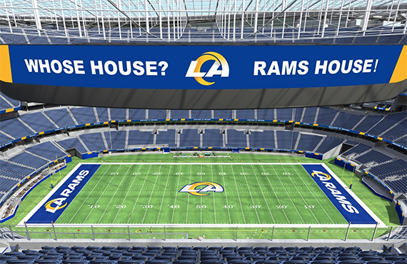
So wasn't the 5 billion dollar stadium supposed to be shaped like the Rams old logo?

Must have slipped Demoff's mind. Oooopps.....
 
  • HaHa
  • Like
Reactions: Corbin and Merlin
The new logos are quite bad, they are just really soulless. I have heard from Allbright, someone posted a link in r/LosAngelesRams that the new uniforms are going to be just as/ or worse than the new logos.
 
  • Like
Reactions: LARAMSinFeb.
View attachment 34902

So wasn't the 5 billion dollar stadium supposed to be shaped like the Rams old logo?

Must have slipped Demoff's mind. Oooopps.....
I know many folks talked about the coincidence of the shape, but I never heard anyone from the organization say it was planned that way. We always new from day 1 in LA we were getting a new logo.
 
  • Like
Reactions: Bootleg
I've had a few days to settle my mind.
I can't get used to it. Wouldn't say i hate it, but not a fan.
I thought the most recent navy and white logo was ok.
The new one looks ike it has had the outline done then someone will be here in the morning to put the finishing touches to it.

What with all the unofficial logos popping up, the official one just ooks so basic.
And yeah, it does look like a puma.

I'm a sentimental person, and part of the problem is that i like things as i originally discovered them.
Which is why the Rams logo will always be this to me:
 

Attachments

  • los-angeles-rams-logo.jpg
    los-angeles-rams-logo.jpg
    76.4 KB · Views: 116
The new logos are quite bad, they are just really soulless. I have heard from Allbright, someone posted a link in r/LosAngelesRams that the new uniforms are going to be just as/ or worse than the new logos.
Day 3 and the new logos still suck. They will be worse than a bad longterm contract or a middle school offense, because they will always suck.
 
They might tweak the Ram head logo a bit , a tiny bit , but that horn is hear to stay

I was reading that article from the design team , and their whole concept is designed around that one horn , it is used on both logos and can also be used as a stand alone look

so I'm betting the new uniforms are designed around that horn as well , I'm coming to the conclusion that the horn on the helmet will be the same as well , I know alot here have speculated it as well , but I was kinda holding out hope they would keep the horns on the helmets the way they were , but I don't think that is going to happen

my question now is , will the horns start out white , then fade to yellow


“Once you see the uniforms in the stadium with the way we’re utilizing our designs and the "identity system" as a whole, I think you’ll really start to see how and why we’ve done everything.”
 
  • Cheers
Reactions: Ram65
This freaking sucks. Just when things start to get settled again they pull this crap out.
Hate change when there is so much history to something,unless it’s done with class & style.
 
The fact the team is emphasizing LA shouldn’t be an issue since the team is based in of all places - LA

I mean Kansas City has KC on their helmet, the Giants, Ravens, Satan’s Friends, The Jets all feature their city’s initials or name on their logo. So the fact LA is features shouldn’t matter much if you are a lifelong fan from So Cal or from Florida.

I think what is bothering all fans is the shear suck of the entire design. Pure and simple