Concept Helmets
- Thread starter Ltrautman
- Start date
-
To unlock all of features of Rams On Demand please take a brief moment to register. Registering is not only quick and easy, it also allows you access to additional features such as live chat, private messaging, and a host of other apps exclusive to Rams On Demand.
You are using an out of date browser. It may not display this or other websites correctly.
You should upgrade or use an alternative browser.
You should upgrade or use an alternative browser.
Dieter the Brock
Fourth responder

Did anybody else feel offended by these helmets? Rams helmets not having horns on them is a blasphemy!
This sucks all they did was copy and paste the logo on the helmet...This is atrocious...It all about the Horns, about the Horns, about the Horns, No treble!Very creative but no thanks.
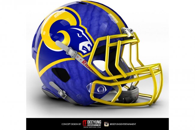
Removing The HORNS from the helmet would be sacrilege and grounds for divorce!
This concept reminds me of when you would get a mini plastic helmet out of a gum ball machine and the sticker was to small.

This concept reminds me of when you would get a mini plastic helmet out of a gum ball machine and the sticker was to small.
Well I personally hate them because they took away the one thing that made me fall in love with the Rams.Don't know why you all hate them. I think they're pretty tough. I do prefer the horns though.
For example, I see it as them telling me that they have a better concept of my girlfriend but she's going to have a smaller butt than before. What?!!.... No, that's the reason I asked her out in the first place, lol.
I took a peak at all of the helmets. Only one, in my opinion is an improvement.

Jmo but I prefer the tiger stripes on the helmets. It goes better with the stripe thing the have going w/the Bengals unis.
I only enjoyed a handful: Bills, Bucs, Chargers, Cowboys, Jags (almost a carbon copy), Jets, Lions, Titans. However aesthetically I don't think any are an improvement over the current helmets for the respective teams. Also not a fan of the "bigger is better" concept. The freakishly big logos just look terrible on most of these helmets.
Last edited:
Yea, for some reason, they decided to do 33 helmets, and the Oilers logo is the extra. I think they are terrible, all of them. The only one I think is an improvement is the Jacksonville, and that is only because their current helmet is ridiculous.Question is, does the Oilers helmet belong to Tennessee or Houston. I can see all of the outrage in Houston sports fans if it was for the Titans.
LazyWinker
Pro Bowler
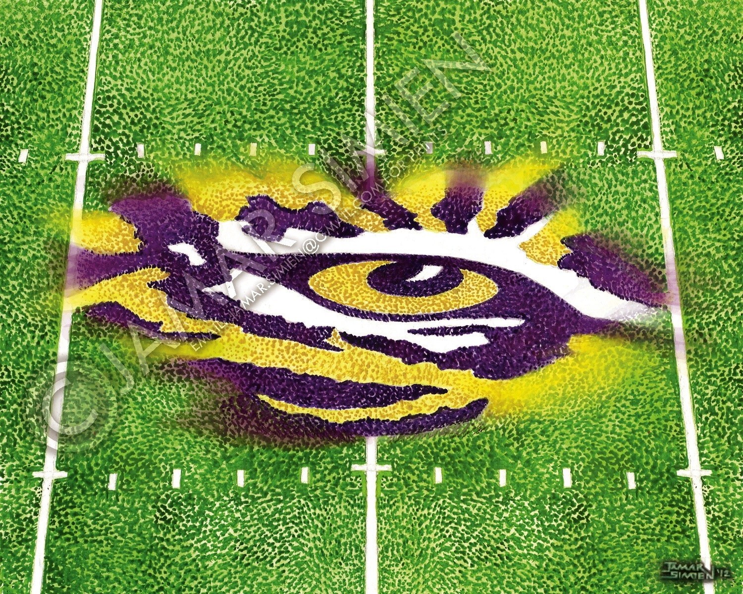
I don't like the huge one but the Bengals have about the ugliest uniform in the league. I don't like the current striped helmet. I think it would be cool if they did something to the helmet like the LSU tiger eye on their 50 yard line.Jmo but I prefer the tiger stripes on the helmets. It goes better with the stripe thing the have going w/the Bengals unis.
I only enjoyed a handful: Bills, Bucs, Chargers, Cowboys, Jags (almost a carbon copy), Jets, Lions, Titans. However aesthetically I don't think any are an improvement over the current helmets for the respective teams. Also not a fan of the "bigger is better" concept. The freakishly big logos just look terrible on most of these helmets.

JMO, but those might be some of the worst concepts I've ever seen. It's like someone from the early 90's designed those.