Rank the XFL Uniforms
- Thread starter CGI_Ram
- Start date
-
To unlock all of features of Rams On Demand please take a brief moment to register. Registering is not only quick and easy, it also allows you access to additional features such as live chat, private messaging, and a host of other apps exclusive to Rams On Demand.
You are using an out of date browser. It may not display this or other websites correctly.
You should upgrade or use an alternative browser.
You should upgrade or use an alternative browser.
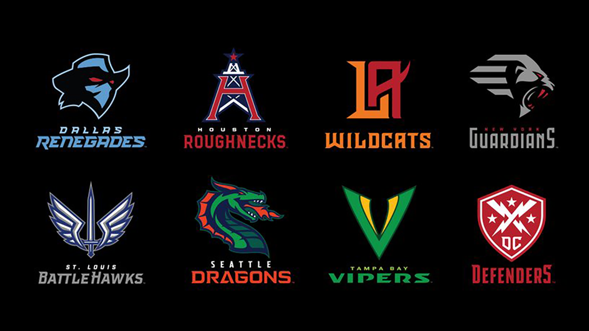
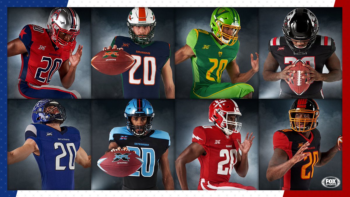


LA is fuckin hideous. I don't know how you can fuck it up that bad.
Best is DC. Simple and bold.
Best is DC. Simple and bold.
The Wildcats uni reminds me of the Burger King building of the 1980s.
Battlehawks all damn day. Guardians and Defenders are cool too. LA is a joker costume.
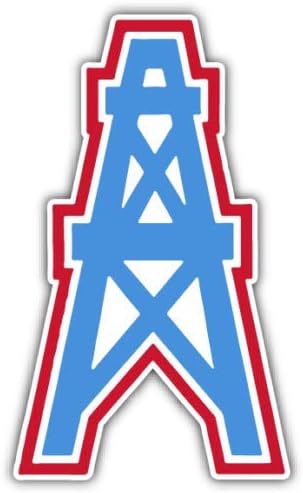
Roughnecks for me for the simple fact their logo is a direct tribute to the Oilers and the uni's are pretty good. Also the only other team I picked was Washington.
I do believe you are onto something...The Wildcats uni reminds me of the Burger King building of the 1980s.

Guardians for me as they have the best logo/helmet IMO.
Vipers logo on helmet is the worst, they shoulda done it like the seahags helmet but with a snake. A giant V is all they could come up with? Every time I see it I can only think of the word vagina(kinda looks like one too) lol, which sucks cause thats the team im rooting for.
Roughnecks look like the oilers and Patriots merged together.
Defenders logo looks like a soccer club logo

Seattle Dragons? What five year old came up with that team name?
I don't hate these LA uniforms as much as most here seem to. One team yesterday was it Seattle? They were a direct ripoff of Auburn.
- Thread Starter Thread Starter
- #13
I really like the BattleHawks, and their blue.
Roughnecks look like a classic, Oiler reference maybe reason.
I like the Renegades. I think the logo is cool, and it works with the colors.
The Vipers look good on TV. That’s my 4th pick.
Roughnecks look like a classic, Oiler reference maybe reason.
I like the Renegades. I think the logo is cool, and it works with the colors.
The Vipers look good on TV. That’s my 4th pick.
Love the Roughnecks uniforms and name.
Stl’shelmet and logo is beast asf but I think they kinda had the uni’s plain from what they could have done. Smh
I like the dragonsuniforms and Helmet but with the blue uni it’s horrible.
Stl’shelmet and logo is beast asf but I think they kinda had the uni’s plain from what they could have done. Smh
I like the dragonsuniforms and Helmet but with the blue uni it’s horrible.
RamsOfCastamere
I drink things, and know nothing
I like the Vipers the best! The others look like current NFL uniforms.
Dieter the Brock
Fourth responder
I like the Vipers the best! The others look like current NFL uniforms.
That logo looks like a green vagina to me...
- Thread Starter Thread Starter
- #17
So... you... like it....?
Dieter the Brock
Fourth responder
So... you... like it....?
With a different color scheme I’m into it

RamsOfCastamere
I drink things, and know nothing
But is that a bad thing?
ArkyRamsFan
Hall of Fame
They all suck and look like something one would see in a junior high league on Friday nights.
I vote for Mr. NOTA......
~ArkyRamsFan~
I vote for Mr. NOTA......
~ArkyRamsFan~