i can't unsee the limp-dick on the Rams head logo.
New Rams logos
- Thread starter SWAdude
- Start date
-
To unlock all of features of Rams On Demand please take a brief moment to register. Registering is not only quick and easy, it also allows you access to additional features such as live chat, private messaging, and a host of other apps exclusive to Rams On Demand.
You are using an out of date browser. It may not display this or other websites correctly.
You should upgrade or use an alternative browser.
You should upgrade or use an alternative browser.

i can't unsee the limp-dick on the Rams head logo.
Well if you guys keep talking about it and posting pictures about it....I can't see how you would.
For me after I saw it the first time when someone mentioned it I now can’t unsee it. Kinda like the first time you can see the man in the moons face. Now that’s what I see when looking at the moon.Well if you guys keep talking about it and posting pictures about it....I can't see how you would.
That looks BADASS. I'm glad you posted this.
I'm seriously gonna order one of these for myself now.
Dieter the Brock
Fourth responder
the shlong on the Logo was most likely intentional
Remember the Kentucky Wildcats logo?

They eventually changed it when they realized what the designers had done

I mean designers do this all the time. Hidden dicks and other messages are tools of the trade.
There are some good ones out there. I mean how does a designer resist when given such great material? Like unwitting farmers’ love of grain silos and hay bails?

So I think it was put there on purpose cause it’s what designers do to not only get paid but have the last laugh.
That means just cause you didn’t originally see the drooping schlong in the logo until someone on the board mentioned it, doesn’t mean the limp dick isn’t there - or that it wasn’t intentional
I bet everyone on this forum smoked cigarettes in our youth and tripped out on the Camel cigarette package, then Ol’ Joe Camel himself enough to know what’s really going on


Watch the Rams fix the issue soon

Remember the Kentucky Wildcats logo?
They eventually changed it when they realized what the designers had done
I mean designers do this all the time. Hidden dicks and other messages are tools of the trade.
There are some good ones out there. I mean how does a designer resist when given such great material? Like unwitting farmers’ love of grain silos and hay bails?
So I think it was put there on purpose cause it’s what designers do to not only get paid but have the last laugh.
That means just cause you didn’t originally see the drooping schlong in the logo until someone on the board mentioned it, doesn’t mean the limp dick isn’t there - or that it wasn’t intentional
I bet everyone on this forum smoked cigarettes in our youth and tripped out on the Camel cigarette package, then Ol’ Joe Camel himself enough to know what’s really going on
Watch the Rams fix the issue soon
I'm not even worried about the dick on the forehead. The eyes just look placid to me, surprised they didn't give them eyelashes.
The fan redo of the logo gave it eyes and it was immediately far better and more than good enough for me. Overall structure of it is fine for me, it's just the feel of it the fuckin thing looks almost timid.
The fan redo of the logo gave it eyes and it was immediately far better and more than good enough for me. Overall structure of it is fine for me, it's just the feel of it the fuckin thing looks almost timid.
It was funny for about 10 minutesthe shlong on the Logo was most likely intentional
Remember the Kentucky Wildcats logo?
View attachment 36247
They eventually changed it when they realized what the designers had done
View attachment 36248
I mean designers do this all the time. Hidden dicks and other messages are tools of the trade.
There are some good ones out there. I mean how does a designer resist when given such great material? Like unwitting farmers’ love of grain silos and hay bails?
View attachment 36249
So I think it was put there on purpose cause it’s what designers do to not only get paid but have the last laugh.
That means just cause you didn’t originally see the drooping schlong in the logo until someone on the board mentioned it, doesn’t mean the limp dick isn’t there - or that it wasn’t intentional
I bet everyone on this forum smoked cigarettes in our youth and tripped out on the Camel cigarette package, then Ol’ Joe Camel himself enough to know what’s really going on
View attachment 36251
View attachment 36250
Watch the Rams fix the issue soon
View attachment 36252
but I've moved on
The logo is like Pinocchio, the better the team plays, the bigger and harder the pecker grows!
@Dieter the Brock that’s what you call so bad... it’s good. Lol.
Imagine walking into the office wearing a polo with that stitched on it as a crest.

just to be fair , that was never the Iowa State Fair logo , it just showed up on social media one day . I don't think they ever did figure out who made it.................lol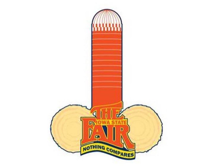
@Dieter the Brock that’s what you call so bad... it’s good. Lol.
Imagine walking into the office wearing a polo with that stitched on it as a crest.
just to be fair , that was never the Iowa State Fair logo , it just showed up on social media one day . I don't think they ever did figure out who made it.................lol
Yeah, I assume that was a fake. Too obvious. But nicely done.
Actually kind of cool to have you confirm.
")
Dieter the Brock
Fourth responder
It was funny for about 10 minutes
but I've moved on
The new Rams logo is what it is.
Unfortunately for those of us who have yet to move on we know that if we Google “logo & penis” into search the Rams new logo pulls up. Not sure how funny that really is.
I wish I could legitimately rock a new cap with our new killer logo, but it’s cool, I’ll just be sticking with my sweat stained blue and white cap for the meantime. Every since I have had this hat we hired McVay, drafted Goff, and won the NFC Championship. I’ll just wait to get a new cap until the Rams fix the penis issue on the logo.
* the Iowa Fair logo though, that’s hilarious
Here's why I can't take this crusade seriously. This logo still has ALL the things people are complaining about. The shape of the horn, the obsession with a dick on the face, the morning news, script everything.
Just because someone slapped an eyeball, made the accent line pointy, and mashed it with the script logo doesn't erase all the other points.
Why is the back of it so boxy? It looks clunky. Also, I just noticed that one of the horns has a gradient and the other doesn't. That looks like a mess. Finally the "A" doesn't mesh well with the right horn. It looks tilted, like a picture frame hanging crooked on a wall.
I get that people don't like what the team came out with, but IMO this concept isn't exactly better either when you really dissect it. It's actually worse IMO.
naw. disagree, but that's ok.Here's why I can't take this crusade seriously. This logo still has ALL the things people are complaining about. The shape of the horn, the obsession with a dick on the face, the morning news, script everything.
Just because someone slapped an eyeball, made the accent line pointy, and mashed it with the script logo doesn't erase all the other points.
Why is the back of it so boxy? It looks clunky. Also, I just noticed that one of the horns has a gradient and the other doesn't. That looks like a mess. Finally the "A" doesn't mesh well with the right horn. It looks tilted, like a picture frame hanging crooked on a wall.
I get that people don't like what the team came out with, but IMO this concept isn't exactly better either when you really dissect it. It's actually worse IMO.
Thanks guys; now I see dicks on all logos with a ram.

LOL

Oh look, Colorado State doesn't have one; but it does have ovaries.

LOL
Oh look, Colorado State doesn't have one; but it does have ovaries.
naw. disagree, but that's ok.
That's fine. Just saying if this was the primary logo it would be the messiest and clunkiest in the entire league.
And I'm just saying it would be badass. *shruggs. I'm not part of a movement, I just know what I like.That's fine. Just saying if this was the primary logo it would be the messiest and clunkiest in the entire league.