New Rams logos
- Thread starter SWAdude
- Start date
-
To unlock all of features of Rams On Demand please take a brief moment to register. Registering is not only quick and easy, it also allows you access to additional features such as live chat, private messaging, and a host of other apps exclusive to Rams On Demand.
You are using an out of date browser. It may not display this or other websites correctly.
You should upgrade or use an alternative browser.
You should upgrade or use an alternative browser.

I was born in Anaheim in 1971 and I like the Logos. I am a little nervous about the uniforms, but the logos are solid to me, "an old Rams fan"
but your avatar is different....lol

Just saw this ad on my FB page. As bad as we all know it looks I saw this and about started crying. So fucking embarrassed. Hands down the worst of any team.......
Look at the main page that shows all team... it's sad AF.
 www.foco.com
Look at the main page that shows all team... it's sad AF.
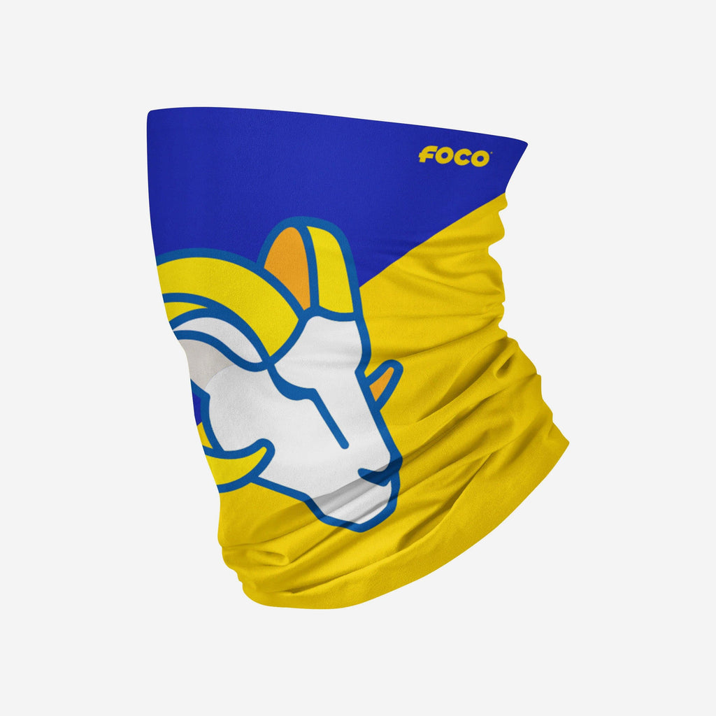
Los Angeles Rams Big Logo Gaiter Scarf
This Los Angeles Rams Big Logo Gaiter Scarf will keep your neck covered with lightweight, breathable material and help you represent your favorite team whenever you put it on. Features All-over printed, team color design with bold team logo display, in case there were any doubts where your...
www.foco.com
Last edited:
It's funny because no one would even know who that is lol what is the point of a logo where most people can't tell what it is in passingJust saw this ad on my FB page. As bad as we all know it looks I saw this and about started crying. So fucking embarrassed. Hands down the worst of any team.......
Look at the main page that shows all team... it's sad AF.
Los Angeles Rams Big Logo Gaiter Scarf
This Los Angeles Rams Big Logo Gaiter Scarf will keep your neck covered with lightweight, breathable material and help you represent your favorite team whenever you put it on. Features All-over printed, team color design with bold team logo display, in case there were any doubts where your...
OntarioRam
Hall of Fame
Just don't buy any merchandise. That is my plan. Which is unfortunate, because the colours are great, and I was looking forward to some new gear. Negative fan feedback, being a laughing stock around the NFL, *AND* having merchandise sales plummet should be able to make the organization change the logo sooner rather than later - or at least revert to lots of merchandise bearing the old logo, passed off as "retro". We'll probably be stuck with this mess for a least a few years though, unfortunately.
Agreed.... I won't buy anything with that Logo.Just don't buy any merchandise. That is my plan. Which is unfortunate, because the colours are great, and I was looking forward to some new gear. Negative fan feedback, being a laughing stock around the NFL, *AND* having merchandise sales plummet should be able to make the organization change the logo sooner rather than later - or at least revert to lots of merchandise bearing the old logo, passed off as "retro". We'll probably be stuck with this mess for a least a few years though, unfortunately.
Elmgrovegnome
Legend
the only thing that makes that look good is the colors and the LA Rams writing. Takeaway Rams and it looks like Shit.
Grabbing an identity that says “Rams”... Huge miss with what the Rams did with these logos.
If you were not an NFL fan... looking at that scarf... no idea we are “The Rams”.
That’s bad.
“Son. That’s not the Chargers and that’s not a C.”
“If you tip your head sideways, blur your vision a little bit, and imagine that tip curls up like a Rams horn”
“It becomes a Ram horn”
“And the two colors, the split in the middle, ignore that”
“See. It’s a Ram horn. That’s the Rams”
Half the logos in the NFL , you would have no idea what they were forIt's funny because no one would even know who that is lol what is the point of a logo where most people can't tell what it is in passing
I have to disagree with you on that one Brotha. Most are very distinct and recognizable. Will ours become more recognizable over time? Maybe, but right now it's a hot muddied mess. Especially in the form it takes on this gaiter scarf.Half the logos in the NFL , you would have no idea what they were for
given time , it will be just as recognizable any other NFL logo
take the Cowboys , one of the most recognizable logos in the world , but it's simply , just a star , there is absolutely nothing about a blue star that would have made me think of a cowboy
Giants have nothing but a ny , and a very simple ny at that , that doesn't exactly scream Giants
even the Dodgers have nothing but a simple LA for a logo , but thats pretty recognizable
I actually like the Rams new logo , , do I think it could have been better , yea , sure , but I don't hate it
if you weren't a sports fan , how many people would recognizable this logo
Sorry you're not going to win that argument in here. The Dodgers have had 2 logo's in their history a B or the Dodgers name. They've had the LA on their hats for probably 60 years. The logo started out like this after they moved away from just the B.even the Dodgers have nothing but a simple LA for a logo
And in 2012 it evolved into it's current form.
The first Rams logo in LA?

How the hell do you this LAC stuff is garbage and nothing will change that in the majority of peoples minds.
yea , I just meant those two lettersSorry you're not going to win that argument in here. The Dodgers have had 2 logo's in their history a B or the Dodgers name. They've had the LA on their hats for probably 60 years. The logo started out like this after they moved away from just the B.
And in 2012 it evolved into it's current form.
The first Rams logo in LA?
How the hell do you this LAC stuff is garbage and nothing will change that in the majority of peoples minds.
every team has like 2 or 3 logos
when you see someone wearing a Dodgers hat with just the LA on it , or a Yankees hat with just the NY on it , you instantly know what it stands for , without having the team name on it
the new Rams LA , will do the same...........................in time
Last edited:
Don’t worry the logo only looks cheap. It was, in fact, quite expensive to acquire. Lol.cheap looking seems to be a recurring theme.
.
yea , I just meant those two letters
every team has like 2 or 3 logos
when you see someone wearing a Dodgers hat with just the LA on it , or a Yankees hat with just the NY on it , you instantly know what it stands for , without having the team name on it
the new Rams LA , will do the same...........................in time
View attachment 35520
View attachment 35521
The blue outline on the white background makes the horn stand out so much better on the LA.